Your university’s website is one of the most important investments you’ll make in when it comes to the marketing you do to recruit more students to your school. So, what makes a great university website? Read on to find out what the best university websites in 2017 have in common – and how your school can emulate their success.
Good websites these days do more than display information; they build a bridge to your prospective students, their families, and donors. Your university website must achieve the highest level of aesthetic appeal and usability that will build an ongoing relationship with visitors and keep them coming back for more information.
It’s not cheap to recruit new students to campus. In fact, it costs universities on average more than $2,000 to recruit just one new student! This should make it even more appealing and effective to make your first introduction really shine, and “hook” ‘em on your great content, ease of use and stellar design.
To create that kind of bridge to attract quality students and their families who will bring their leadership, creativity, diversity and academic excellence to your campus, you’ll want to incorporate these five essential elements into your higher education website design.
When people come to your college’s website they are looking for certain types of information. You need to provide the information about the following topics right up front – don’t make them search for it. Make it awesome, draw them in, and be free with the use of imagery and graphics!
- admissions
- academics
- faculty
- school resources
- financial aid
- social life
- sports
- internship opportunities
- professional recruiting
Be sure your website navigation – how users get from one page to another of interest – is clear, intuitive, responsive, and mobile friendly.
Make each navigation tab clear so viewers know exactly what to find in each section. Consider using a simplified navigation bar that takes users to larger departments.
Clean, neat section titles, a low-profile top navigation bar and a consistent page layout can all help visitors orient themselves with the content. Make sure your page headings stand out— you can do this through the use of vibrant color or varying font size — so readers understand the main purpose of the page.
You also need a responsive web design. Responsive design adjusts itself based on the user’s screen size. In other words, when people visit your site, the site’s elements — including images, text, and more — are all arranged properly on the screen, whether the viewer is looking at your site on their desktop, mobile device, or tablet.
What’s more, Google’s search algorithm gives MUCH more priority to websites that are mobile-friendly.
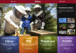
Notice below how Bates College lays out its website navigation bars.
So, you’ve got the navigation down. Now you need to organize your content and display it in an attractive and informational way.
A great starting point is to consider your intended viewers, taking into account their habits, preferences, and goals. Your higher education website design needs to feature functionality and information that appeals to different target personas: current students, prospective students, families, faculty, and donors or the community at large. Create personas for these audiences, crafting the most relevant content for each and making that content easy to find and absorb.
The best university websites utilize a home page that’s generally clean, sleek, and uncluttered. The links that you provide on the home page, therefore, should be minimal yet broad-sweeping. With few variations, most effective higher education website designs provide the following links from their home page: About Us, Academics, Admissions & Financial Aid, Athletics, Alumni, Student Life, and Offices & Departments.
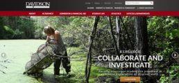
Take a look at this example from Davidson College in North Carolina. Notice the navigation bar near the top of the page, with additional links just above for the specific target audiences of Alumni, Parents & Family, and Business & Community.
Here are a few tips for optimizing a few key pages that live in the sections outlined on the homepage above:
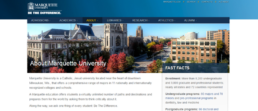
About Us
A top place for students to go to find out if your college is the place for them, your About Us page should lead with an informative summary of your school. This summary should be in plain language and should offer an easy-to-scan fact list. Emphasize your school’s strengths and achievements. Gather those statistics, rankings, and awards and make them “snappy”. Showcase a video that will give a sense of your school and will appeal to a broad range of users.
Academics
From your Academics page, make it easy for visitors to view a list of majors and programs. For colleges with a great number of programs, offer the option to view the majors or programs by field or school. Remember, prospective students look for majors and programs, not schools or colleges.
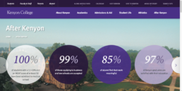
Alumni
Along with alumni news and events, the Alumni page is a great spot to provide information about job placement after graduation. Research has shown that the first page where users went to find this information about whether or not the investment in education will pay off was the Alumni page. Provide numbers and sources to support your claims about job placement.
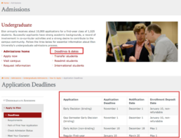
Admissions/Applications
While it might be considered a no-brainer to have deadlines prominently placed on your college admissions website, unfortunately, a number of colleges are failing at this. You need to clearly display application deadlines and the description of the application process. Include a step-by-step description of the application process. Make it easy to find and clear to read. If there are multiple or complicated deadlines, consider using a dedicated Deadlines page within this section.
The aesthetic appeal of your website will largely influence your site visitors. The layout, colors, graphics, logo, and other visual elements will all help create the brand for your higher education institution. Consistency in that branding is crucial. If your website is large, with each department owning its own page and information, it’s common to find inconsistencies.
- Clearly identify your college name on every page. Not everyone arrives at your website from the home page. Many will arrive on internal pages via search.
- Use images that reflect your college’s values and priorities. Rather than using stock photos on your website, use authentic images, representative of what it’s like to be at your school.
- Focus on creating sufficient white space. White space provides visual breathing room for the eye. An abundance of visual clutter on a website will drive away your prospects. Instead of putting paragraphs of information and updates everywhere, use large, high-definition images paired with bite-sized chunks of text.
- Use a consistent and limited color palette on all pages of your website. Using a hodgepodge of colors will create a lasting impression, but it won’t be the professional image you were aiming for.
So far, we’ve focused on the presentation aspects of your website – what it looks like. Equally important is the content that you offer viewers when they enter your site.
Creating dynamic content allows you to customize the experience for your audience based on the parameters that you set. By personalizing the experience, your website visitors will appreciate your attention to their individual needs and desires, staying on the site longer.
Interactive content creates an engaging experience for your website visitors. When people visit your site, their own actions produce responses, whether they’re working their way through an interactive infographic or clicking on expanding links on your home page.
Feature calls to action (CTAs) on every page of your website. Essentially, you’re telling your visitor what you want him or her to do next, whether it’s to fill out a form or to click on a video sharing student testimonials. You may want the viewer to check out the housing options available. Whatever the purpose of your call to action, the CTAs should relate to the content on that web page and bring viewers further into your admissions funnel.
Effective calls-to-action buttons stand apart from the rest of the content. Use compelling language, bright colors, and offer a reason to follow the command rather than simply a dictation.
Authentic content may be created by faculty or students on campus. Content created by students for students can be more conversational and engaging, and you also send the message that you trust your students and value their insights, which is inherently pretty cool.
Content written by students or faculty can be powerful, just as non-fiction storytelling about them can be equally enticing. Tell what your students are accomplishing in the “real world”, tell stories about how you spend donations, tell about the accomplishments and research of your faculty. Give people a reason to come back to your website for more.
Notice the call-to-action button, inviting visitors to read a student’s story, on the University of Texas at Austin Admissions page.

If you’re looking for a way to improve your university website design or to bring it into alignment with your other inbound marketing efforts, we’re here to help. You can contact us to learn more about our services, our trainings, or to request a free consultation to develop effective strategies for your organization. Let’s position your organization among the best college websites out there!
If you found value in this blog post, we think you’ll also like our monthly education marketing newsletter. They’re packed with value and will help keep you up to date with how the latest social media trends impact digital strategy for EdTech and Higher Education organizations.
Does your social media marketing strategy need a little guidance? We’re helping organizations transform their digital marketing efforts through personalized 2 hour, 1-on-1 trainings. These trainings include:
- Audit of your Facebook, Instagram, & Snapchat accounts
- Maximizing your social media marketing organically
- Customized strategy for running ads that convert
- Copies of presentation & notes to review on your own
- Actionable tips to start winning on social media
Learn more through the button below and see if it’s the right fit for you & your team!